Have you ever tried to book a doctor’s visit online and gotten confused right away?
A lot of people feel that way. Online care is now part of everyday life. To such an extent that it is estimated that by 2026, 25–30% of all U.S. medical visits will occur via telemedicine. And of course, why not? It's really very convenient.
People use it when they’re sick, need a quick check-in, or just want advice without sitting in a waiting room. But none of that works well if the website is hard to use. Patients don’t think about “features.” They just want to find what they need without getting stuck.
Many clinics add online tools one by one, and the website ends up feeling messy. Buttons go in circles. Forms feel too long. Video calls take forever to load. Little problems like these make patients give up before they ever reach the doctor. A good telehealth website fixes this by being clear, simple, and easy to use.
In this blog, you’ll learn about seven telehealth features that actually make virtual care better. They are the basics that help people book visits, talk to their doctor, and manage their care without stress. You’ll see what matters, why it matters, and how each feature helps your whole system feel smooth from beginning to end.
So, take a look!
When someone uses virtual care, they’re already looking for relief, speed, or convenience. If the telehealth website feels confusing right from the first click, frustration sets in fast. Patients dislike systems that feel cluttered, slow, or unclear because they make them question whether their care will be just as messy.
A strong virtual care platform should guide them naturally from login to appointment without making them hunt for buttons or second-guess the process. When the experience feels smooth, calm, and predictable, patients feel confident that they’re in the right place.
It only takes one broken link, one slow page, or one unclear button to make a patient stop trying. These issues might look small from the backend, but they shape the entire experience. When your system feels uncertain, patients assume the care behind it might be the same.
Examples of common blockers:
When these moments add up, patients leave before they ever reach the provider.
A busy clinic cannot afford delays caused by missing files or slow software. Staff members often juggle multiple tasks at once, and any glitch disrupts the entire flow of the day. The right features reduce these interruptions and give your team more control.
When tools work together smoothly:
Good digital care isn’t only about the patient side. It’s also about making your team’s job manageable.
Patients judge telehealth websites the same way they judge in-person service. If your system feels steady and predictable, they trust the care behind it. When it feels patched together, they worry about security, accuracy, and reliability.
Virtual care grows stronger when patients feel confident that every step, booking, messaging, and connecting to a visit will work the same way each time.
More people rely on digital healthcare now than ever before. Their expectations rise with every new app, every quick service, and every simple online process they use in daily life. A virtual care system must stay flexible so it can keep up with these changing needs.
Did you know that, according to research, the global market for telemedicine apps was worth over $27.04 billion in 2019? It's expected to grow significantly, reaching over $171.81 billion by 2026, indicating rapid growth in this field.
That kind of growth says one thing loud and clear. There’s real money flowing into virtual care.
If you want to tap into this growth or build a platform that actually earns its share of that market, you need a telehealth website that does the job well. And that starts with a set of must-have features that patients expect from the moment they log in.
It is the first thing patients see when they log in, and that first moment sets the tone for the entire experience. If your dashboard feels clean and easy to understand, people move forward without hesitation. If it feels crowded or confusing, they start off frustrated.
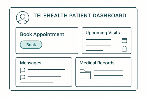
A good dashboard doesn’t try to show everything at once. It focuses on what patients need right now:
A dashboard works well when it reduces mental effort. Patients should be able to scan the page and know what to do.
A clear dashboard guides patients naturally. It tells them, “Here is where you start.” Some great elements include:
These elements keep people from clicking around aimlessly. Instead, they follow a short, predictable path.
Note: If a user needs more than two clicks to reach something important, your dashboard needs a small redesign.
A strong dashboard doesn’t just help the patient. It also helps your team by reducing the number of questions and support calls. When people can find their visit links, files, and notes easily, your staff spends less time explaining basic steps.
A user-friendly dashboard is the backbone of any virtual care platform. When the layout follows strong healthcare website design principles, patients move through the system without confusion. Clear spacing, readable fonts, and simple menus help them find what they need without overthinking each step. The design should also adjust naturally on both desktop and mobile so patients get the same easy, reliable experience no matter what device they use.
In virtual care, communication replaces the physical connection of an in-person visit. Patients need to feel that they can reach you easily and safely. When messaging or video tools fail, patients lose trust faster than in any other part of the digital experience. That’s why dependable communication tools are essential.
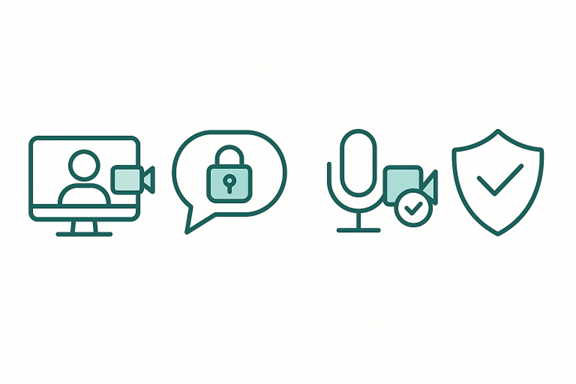
A video visit should feel steady from start to finish. Patients shouldn’t have to guess whether the link will open, whether the camera will connect, or whether the call will drop in the middle of a conversation. A reliable telehealth platform gives them a sense of security, especially when discussing sensitive topics.
Strong video tools usually include:
When these elements work together, the visit feels calm and predictable.
Check: If a video tool requires several steps to start, you may lose patients who are less comfortable with technology. This is especially true for people facing language barriers. Studies show that when a platform isn’t available in their preferred language, many patients abandon the process entirely. Adding multi-language support ensures that everyone can navigate the visit confidently, regardless of digital skill level.
Not every question requires a full appointment. Sometimes a patient needs a quick clarification or wants to share an update. Messaging tools give them a simple way to reach you without calling the office or waiting on hold.
Good messaging tools should be easy to find and easy to use. A patient who is unsure about their medication or looking for follow-up instructions should feel comfortable sending a short message without worrying about where it goes.
Clear communication helps keep visits shorter and more focused. When both sides can exchange messages, share small updates, or prepare before the visit, the actual appointment becomes more efficient. Patients feel more prepared, and providers spend less time clarifying basic details.
Scheduling is often the very first interaction a patient has with your virtual system. If the booking process is confusing or takes too long, they may leave before finishing. Now, there are a few things that you should keep in mind when working on scheduling.
Research shows that patients are encouraged to see a doctor’s open (available) time slots, as well as their upcoming appointments, and the ability to reschedule them. This kind of clarity reduces missed visits and makes follow-ups feel simple instead of stressful.
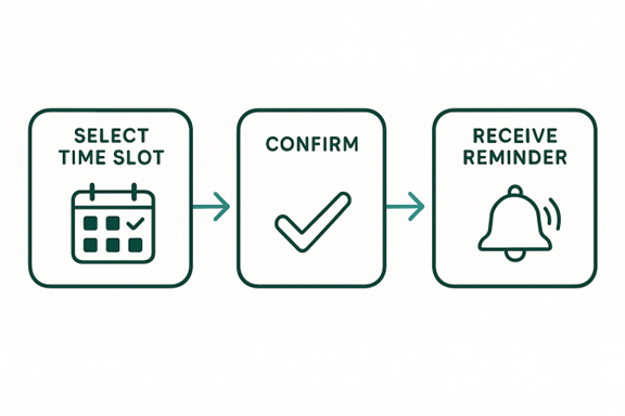
A telehealth website should offer smart scheduling tools, automatic reminders, and easy rescheduling options that work in a few clicks. When patients don’t have to call the office or wait on hold, no-show rates drop, and satisfaction rises. It becomes easier for them to stay on track with their treatment plan, and providers spend less time chasing missed appointments.
Tip: Always keep the next available appointment visible. It helps patients who just need the fastest option.
Many people forget appointments because their day gets busy. Instant reminders sent by text or email help reduce no-shows. They also reassure patients that their visit is confirmed. This small feature saves time for both the patient and the provider.
This is where strong clinic website design comes in. A simple layout with a clear booking button helps users find what they need. The more steps you remove, the better the experience becomes.
Try This Small Tip: Ask a friend or coworker who has never seen the page to book a fake appointment. If they hesitate or ask questions, you know where to improve.
Keeping medical records in one place is a big part of online care. Patients want to see their information without getting confused, and providers need quick access so they can review everything, such as their progress and medications, before a visit. When EHR storage is simple and organized, it makes the whole system easier for everyone.
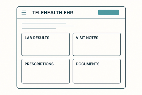
A good setup lets patients and staff find what they need in seconds. It should not feel complicated or hidden behind many steps.
Here’s what strong EHR storage usually offers:
Many clinics choose telehealth software platforms because they connect scheduling, messaging, visits, and records in one system. This keeps everything consistent and reduces mistakes.
The design used in hospital website design also helps here. Clear spacing, readable text, and simple menus make records more comfortable to view.
A good EHR page should let patients quickly find:
When EHR storage works well, providers make decisions faster, patients understand their care better, and your team answers fewer questions. It keeps the entire virtual care flow steady and organized.
Handling payments is one of the most sensitive parts of any healthcare experience. People want to know what they’re paying for, how much it will cost, and whether the payment went through successfully. When the process is confusing or slow, frustration rises fast. A good telehealth website keeps payments simple so patients can focus on care, not paperwork.

A patient might already be dealing with stress, pain, or worry. The last thing they need is difficulty completing a payment. If the page loads slowly or the instructions feel unclear, they start to question the reliability of the entire system.
Smooth payments help in three key ways:
Patients appreciate it when they can finish a payment without calling anyone for help.
Even outside healthcare, people get uncomfortable when prices feel hidden or uncertain. The same is true here. Transparent pricing helps patients feel safe and respected. When they see the amount before checkout, they feel more in control.
Sending prescriptions online should feel quick and reliable. When a visit ends, many patients just want to know their medicine is on the way. Easy e-prescription tools help providers send the right medication to the right pharmacy without delay. This makes care smoother, safer, and less stressful for everyone.
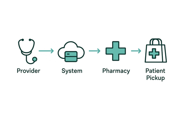
Imagine finishing a virtual visit of a telehealth website and still needing to call the clinic, wait on hold, or drive across town with a paper slip. That takes time you don’t always have. With e-prescriptions, the provider sends your medication directly to your chosen pharmacy within seconds.
Here are a few things strong e-prescription tools should do:
A patient who feels sick wants the easiest path to relief. When your system connects with pharmacies, the next steps feel clear and organized. The patient can pick up medicine sooner, and the provider gets fewer follow-up calls asking, “Is my prescription ready yet?”
Mistakes happen when information is repeated through long calls, emails, or handwritten notes. Pharmacy integration keeps everything digital, and that reduces the chances of misunderstandings. The system checks for common issues like drug conflicts or missing details before sending.
Tip: Show a short confirmation message like “Your prescription has been sent.” It gives patients peace of mind right away.
Most patients reach your online system from their phone. They are often on the go, sitting in a car, waiting at work, or juggling a busy day at home. If your virtual care setup does not load well on mobile, people will leave before they even book a visit. A mobile-friendly design helps every patient feel supported, no matter where they are.
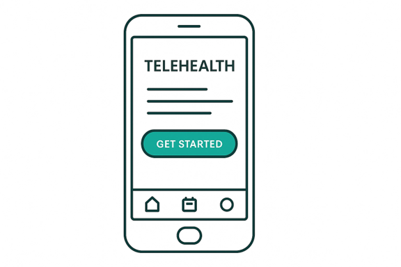
Think about your own habits. When you need quick help, you pull out your phone. You don’t sit down at a computer unless you have to. Patients behave the same way. They want a page that loads fast, buttons they can tap with their thumb, and text they can read without zooming in.
Mobile-friendly design includes things like:
Tip: Test your pages on different phone sizes. If anything feels too small to tap comfortably, adjust it right away.
Speed matters more than people realize. When a page takes too long to open, users assume the whole system is unreliable. Smooth performance builds trust by making every step feel easy.
Tip: Keep images light and your layout simple. Heavy graphics slow everything down, especially on mobile.
Building a strong virtual care setup is a big decision. Whether you’re updating what you already have or starting from scratch, the team or tools you choose will shape the whole experience.
Before choosing anything, take a moment to list your must-haves. Not every clinic needs the same tools. Some need stronger video support, while others care more about scheduling or file sharing.
Ask yourself simple questions like:
Tip: Talk to your staff before deciding. They know the daily problems better than any outside expert.
If you decide to hire help, try choosing a group with real experience in building online care systems. A healthcare web design agency, for example, understands privacy rules, patient behavior, and the kind of layout that helps people find things without stress.
Imagine hiring a general tech team that usually works on online stores. They might design a beautiful layout, but they may not think about things like secure messaging or easy record access. A team that knows healthcare will.
Virtual care depends on trust. Patients share private details, so your system must protect their information at every step. This includes choosing tools that follow HIPAA requirements and keep all sensitive data encrypted from login to logout. When the technical setup respects these rules, patients feel safer sharing their concerns, and providers can focus on care without worrying about compliance.
Virtual care works best when it feels simple, clear, and supportive. Patients want fast steps, steady tools, and a system that helps them get care without stress. When someone visits your telehealth website, they should feel confident from the first click. They should know where to book a visit, how to send a message, and how to join a call without thinking too hard.
The seven features we covered are not just add-ons. They are the parts that shape how people feel about your practice. A clean dashboard, secure video tools, smooth scheduling, fast file sharing, clear payments, easy e-prescriptions, and strong mobile design all work together to create a steady online experience.
Small choices matter too. A readable font, a short message of guidance, or a simple layout can turn a stressful moment into a calm one. When you design with real people in mind, you make care easier for both patients and providers.
And the future of virtual care is even more promising. Tools like AI-based note assistance are beginning to support providers quietly in the background, helping them finish charting faster and focus more on the patient instead of the paperwork. It’s a sign of where telehealth is heading: smoother, smarter, and more helpful for everyone involved.
Virtual care will keep growing, and expectations will keep rising. By focusing on clear tools and a friendly flow, you set up a system that supports everyone and stays strong as patient needs change.
There are several types of telehealth platforms, each offering different levels of support. Some focus only on video visits, while others include scheduling, messaging, and record storage. The right choice depends on your clinic’s daily workflow and the features your patients use most.
Professional designers who offer medical website design services can make your site easier for patients to navigate. They organize pages clearly, simplify the layout, and improve speed on both mobile and desktop. This makes your online care system feel more comfortable and reliable for users.
Start with the core tasks patients use most: booking, messaging, joining visits, and viewing their information. These areas shape the entire experience. Once these steps feel easy and clear, everything else becomes more manageable. Adding new features only makes sense when the foundation is strong.
You don’t need constant changes, but regular check-ins help. Every few months, review how the system is being used. Look for slow pages, unclear steps, or features that patients aren’t using. Small adjustments made regularly keep your platform current without overwhelming your team or your users.

